We built the identities for Kardo TV and One Click Away (OCA) the same way: by starting from the name and what the brand promises, then letting every shape, colour and word follow from it. Kardo TV is a Kurdish-first streaming service; OCA builds websites, automations and AI employees for small businesses in the UAE. The two brands could hardly be more different, and the method held up for both.
This brand identity case study comes from iklipse, a creative and AI production agency working across Iraq and Kurdistan, the UAE, the wider GCC and Egypt. Here is how each brand came together, and what the two projects taught us.
Kardo TV gives Kurdish film and television a home of its own.
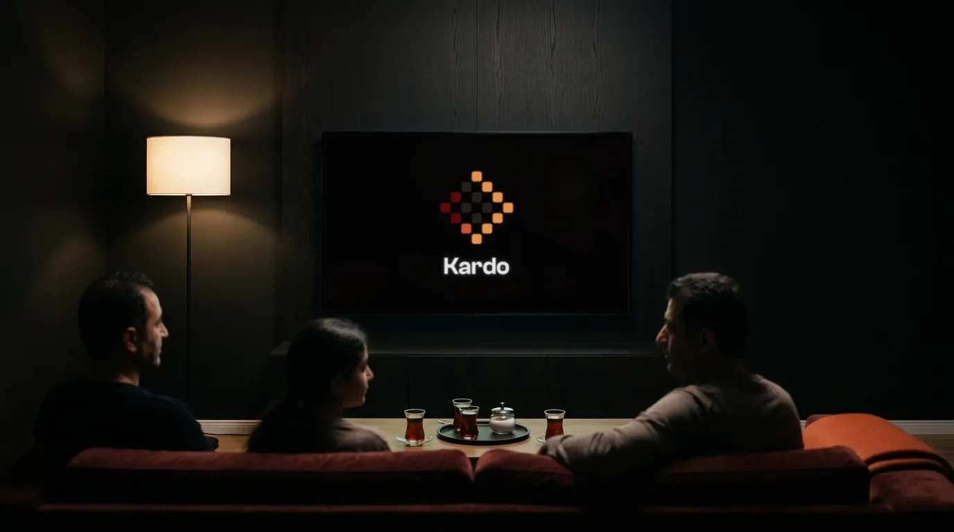
Kardo TV is a Kurdish-first streaming service. It opens with an archive of the dramas, documentaries and programmes made for Kurdish television. It is built for young Kurds, above all those growing up abroad, who already stream everything else they watch.
The problem was easy to describe. Kurdish content tends to appear as one channel among dozens, a few titles in someone else's catalogue, or a blurred upload on a site full of pop-ups. Kardo TV needed to look like the rest of its viewers' screen: confident, modern and made with care.
The emblem turns traditional motifs into screen pixels.
We built an emblem that rebuilds traditional motifs as screen pixels. Each cell holds a film, and in motion the films grow until they fill the frame. Heritage and streaming meet in a single mark, and the mark itself does the job of a trailer.
The palette is named for the way people watch.
Four colours carry the brand: Night, Shade, Play and Sun. Night leads, because most streaming happens in a dark room with a screen glowing in it.
Sorani type is set as carefully as English.
The type system pairs Clash Grotesk and Switzer with Vazirmatn for every Sorani line. The guide includes a Sorani type ladder of its own, so a Kurdish line is set with the same care as an English one. For a brand whose whole reason to exist is the language, this mattered more than anything else.
The tagline is three words.
"Kurdish, full screen." It says what the service is and how it feels, and it gives every campaign a clear line to come back to. Campaign ideas we developed include a cinema front at dusk under a Kardo TV sign for a Kurdish film night, a tram carrying a Kardo TV advertisement, and a gift card reading "A year of Kardo TV".
OCA makes technology feel like one click.
One Click Away builds websites, automations and AI employees for small and family-run businesses in the UAE, and keeps them running after launch. Its clients are a vet, an interior designer, a restaurant owner: people very good at their own trade, with no time to learn the technology.
The logo is built from the name, word by word.
One becomes a circle. Click becomes a cursor. Away becomes an arch. All three shapes are cut from one circle, so the mark is literally the name, drawn.
Colour has rules, down to the share.
Five colours sit around the shapes in fixed shares, so every layout keeps the same balance. Neue Montreal covers both Latin and Arabic, which keeps the brand consistent across the two languages its clients use every day.
The voice names the hour saved, never the tool.
OCA's customers do not care which software runs their bookings. They care that the bookings arrive. So the copy talks about outcomes: a site visit booked for Thursday at 9 am, a salon's day with 11 clients, the evening's orders on a lock screen. The tagline sums it up: "Skip the tutorial."
Both brands shipped with a live guide.
Each brand went out with a living website as its main guide, with a PDF kept as a backup copy.
OCA's guide runs to 13 chapters, live on the web, and its logo, colour, icon and motion pages are built to be played with. The last chapter holds every file a designer needs: logos for every ground, colours as CSS and JSON, the fonts, and the guide itself as a PDF.
Kardo TV's guide does the same job for a streaming brand, with every logo, colour, font and motion file ready to download, and the Sorani type ladder at its centre. We wrote about why we work this way in our earlier post on living brand guidelines.
Here is what the two projects have in common.
- The name did the heavy lifting. Kardo TV's pixels hold films; OCA's shapes spell its name. Neither logo needed a long explanation.
- Language came first. Sorani for Kardo TV, Arabic and English for OCA. Type was chosen for the scripts the audience actually reads.
- The voice was written for the customer. Kardo TV speaks to young Kurds abroad who want their culture on a proper screen. OCA speaks to busy owners who want their time back.
- Everything was built to be used. Both guides put the files first, so the next designer can start working on day one.
Nabil, our founder, led the client relationships on both projects, and they show how our brand experience work runs from the first name sketch to the last downloadable file.
Frequently asked questions
What is Kardo TV?
Kardo TV is a Kurdish-first streaming service, opening with an archive of dramas, documentaries and programmes made for Kurdish television, built for young Kurds at home and abroad.
What does One Click Away do?
One Click Away (OCA) builds websites, automations and AI employees for small and family-run businesses in the UAE, and keeps them running after launch.
What did iklipse deliver for these brands?
The full brand identity for each: logo, colour, typography, motion, voice and a live brand guide with downloadable files.
How do we start a brand identity project with iklipse?
Tell us your name, your audience and what you promise them. Start on our contact page.
Sources: iklipse case studies (Kardo TV, One Click Away).